We celebrate discovery and the unknown, offering bold art prints that showcase unconventional yet inspiring artists, while honouring their unique history and contributions.

branding
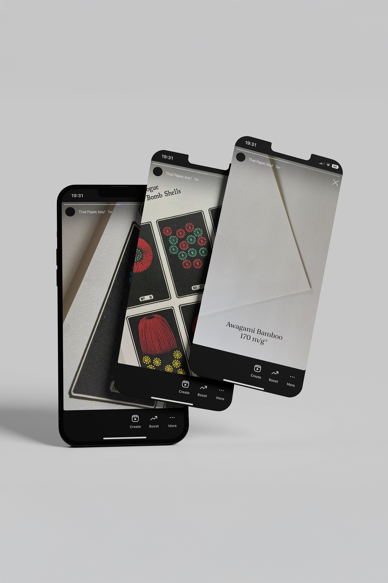
chaotic studio’s branding is rooted in organised chaos.
It may appear messy, but there’s an inherent order where everything has its place. Reflecting the underground DIY culture that has long influenced the art world, our design embodies the spirit of discovery and the raw authenticity of artworks by lesser-known artists, often lost to history.


At chaotic, our chosen imagery aligns with our vision: embracing the beautiful chaos found in both nature and society. We are drawn to scenes of violent protests and acts of resistance, connecting them with the seemingly, but not really, chaotic patterns of nature.
The glitch effect we apply to image treatment merges these elements with our digital reality. Similarly, we bridge the gap between antique artwork and contemporary societal themes, reviving historical visuals with fresh, modern relevance.
BRAND
colours
fonts

The chaotic studio logo makes use of an anaglyph design, creating a sense of disturbance and movement. This visual distortion effect references old tube TVs, with glitches as if trying to fine-tune a channel.
The chosen colour scheme of cyan and magenta further reinforces this retro aesthetic, drawing from the look of old 3D paper glasses. The implication is that it’s just at the edge of understanding, if only the viewer could bring the elements into focus.
Through this intentionally unsettled and unconventional approach, the brand presents a sense of unpredictability. Yet this bold visual identity also conveys a willingness to push boundaries, remaining memorable and impactful.